NOAH’S BOX
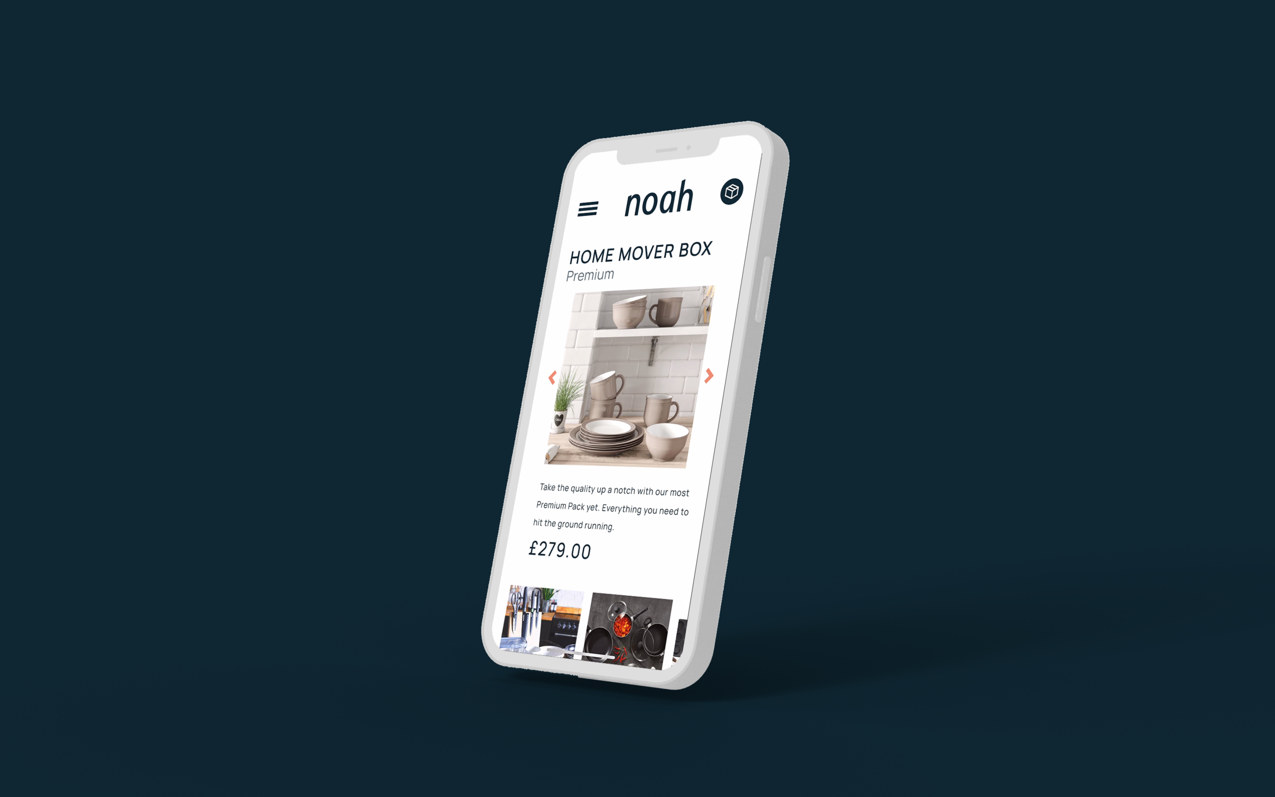
Ecommerce project improving the UX of the existing ‘Customise a box’ feature on Noah’s box website designing for mobile screens and desktop using Figma.
Responsibilities: UX Research, User Interviews, Testing Prototypes, Wireframing low – high fidelity,
Tools: Figma, Adobe XD, Adobe Illustrator, Adobe Photoshop, Hot Jar
Duration: 10 weeks
PROJECT PHASES
Research
Context
During my course at Experience Haus, I worked on a live brief to improve the UX of the existing Customise a box function on Noah’s box website. I decided to focus on mobile screens as during user testing of the existing Noah’s box interface some features were easily missed.
PROBLEM STATEMENT
Noah’s Box needs a way to improve their customise a box feature, as customers find the process lengthy.
Hypothesis
Noah’s Box needs a way to improve their customise a box feature, as customers find the process lengthy.
Existing Customise a box feature
User Task Analysis of Noah’s Box Customise a box feature
This Task Analysis presents the steps that users went through and some of the comments while going through the current customise a box feature.
The Task Analysis presents the different points where the potential consumers were slowed down or confused in the process of customising a box. There was confusion concerning deleting items from a preselected box as it diverted from online shopping experience that they are accustomed to.
User Interviews
I conducted contextual inquiry style interviews where I asked potential costumers to go through Noah’s Box existing customise a box feature.
FEEDBACK FROM USERS INTERVIEWS
“Categories don’t seem organised”
“I don't know what is in the box”
“It’s unclear that I have to remove items from the box to customise”
“Edit/Change, button not intuitive”
“Too much to scroll through on mobile”
COMPETITOR Analysis
I compared Noah’s Box to potential competitors to evaluate where there could be improvement. Noah’s Box succeeds in having a unique selling point in making buying everything needed for life events easy erasing the chance of forgetting items.
However, when it comes to usability of the website and their customise a box process there could be improvement in comparison to their competitors.
Ideation
From the User Interviews I created Affinity Maps in order to organise the common user problems that occurred throughout the User Interviews.
USER FLOW
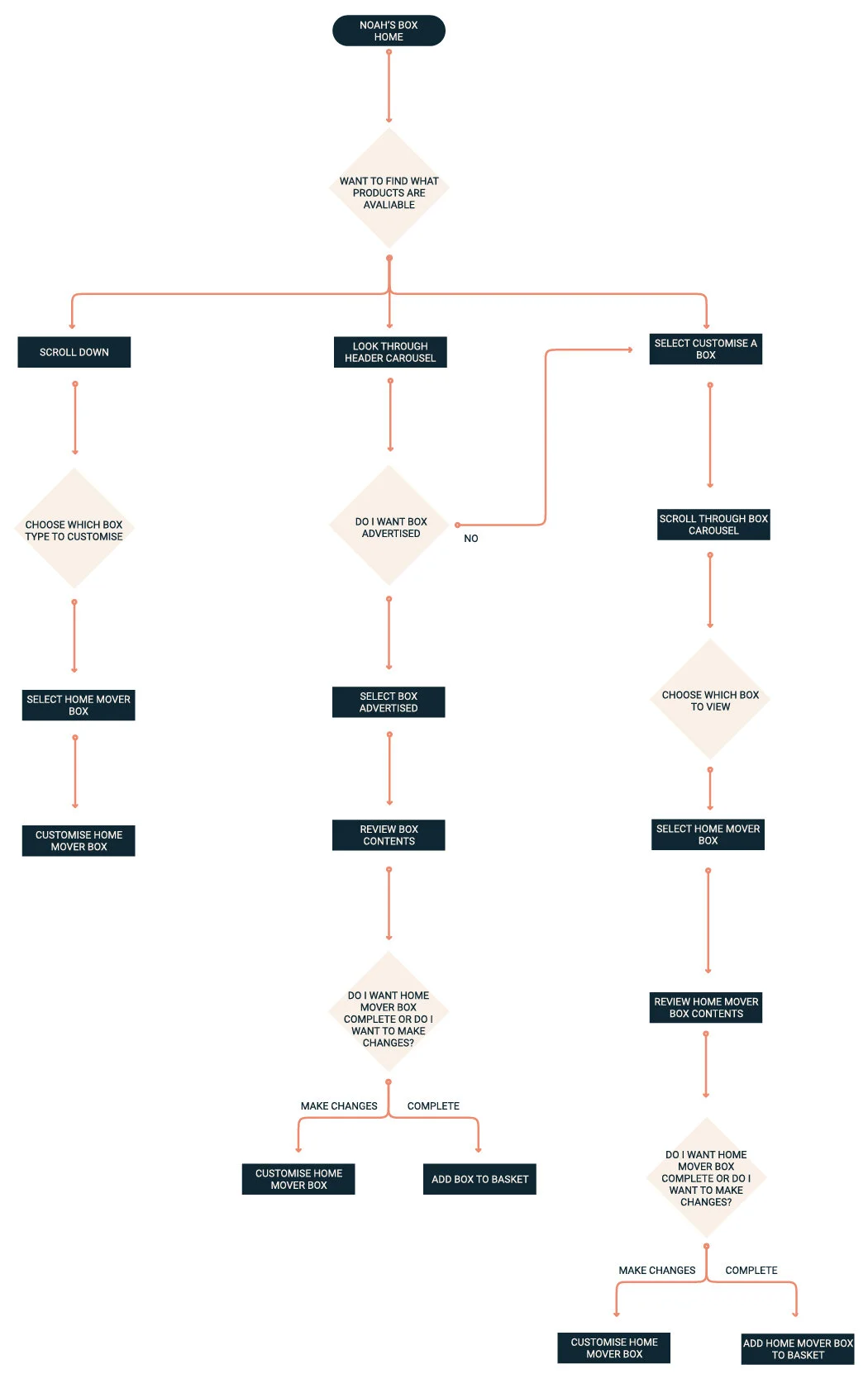
The User Flows present the users journey to navigate from the Noah’s Box Home page to customising a box or Adding a complete box to basket. By doing this it enabled me to understand what was missing from Noah’s Box to enable customers to find the customise a box feature with ease.
Existing User Journey
User Flow of existing user journey to navigate from Noah’s box Home page to the customise a box feature for the Student Box
Updated User Journey
Updated User Flow planning the users journey to navigate from Home page to Customising a box
Development
Low Fidelity Wireframes
Mid Fidelity Wireframes
User Testing
Using low-mid fidelity wireframes, I tested the mobile screens with potential users to validate the user journey and further explore if there were missing screens that could potentially enhance the user journey.
User testing Quotes
TD, 21
“I like that the shopping Journey is familiar”
“I didn’t see a change when I added all to box”
VP, 29
“I like that arrows show there’s more to view”
KM, 27
“The categories make sense”
“The add to box icon is confusing”
RD, 24
“Like that I can see the different boxes I can customise”
Outcome
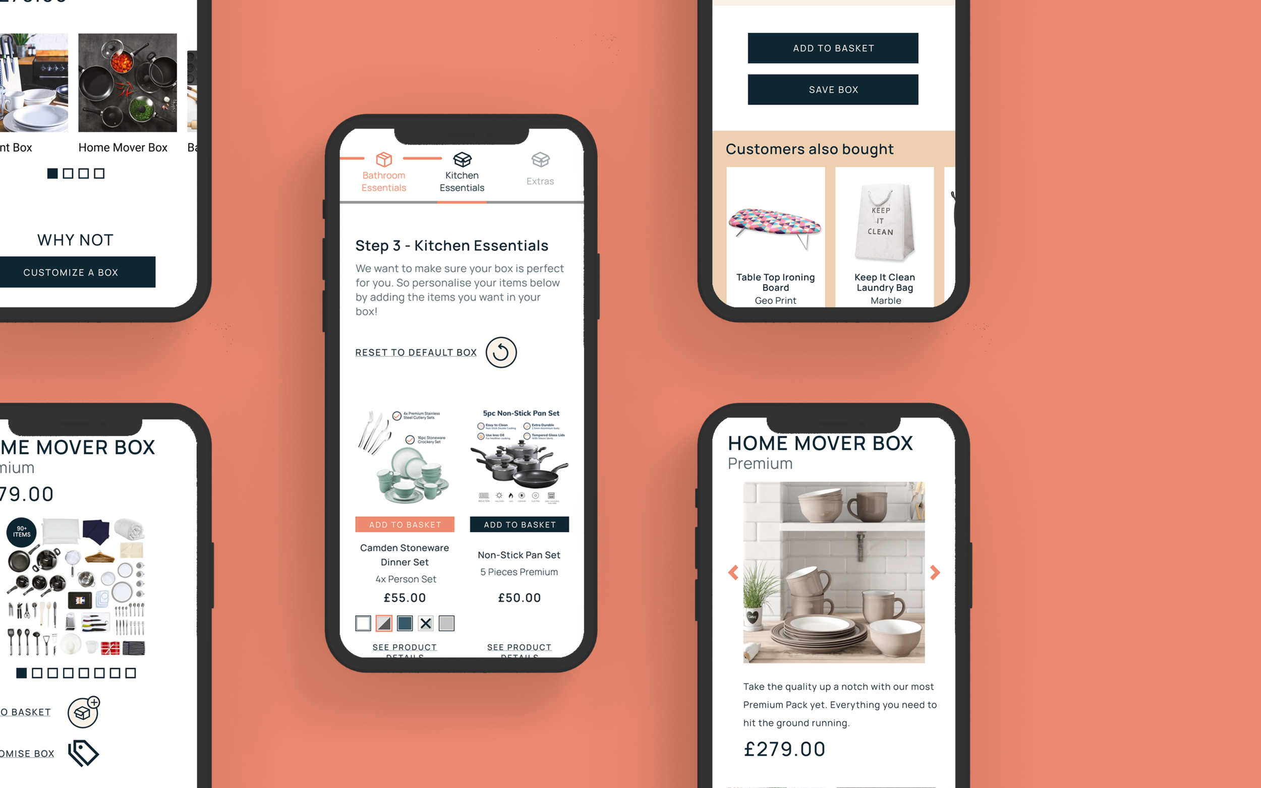
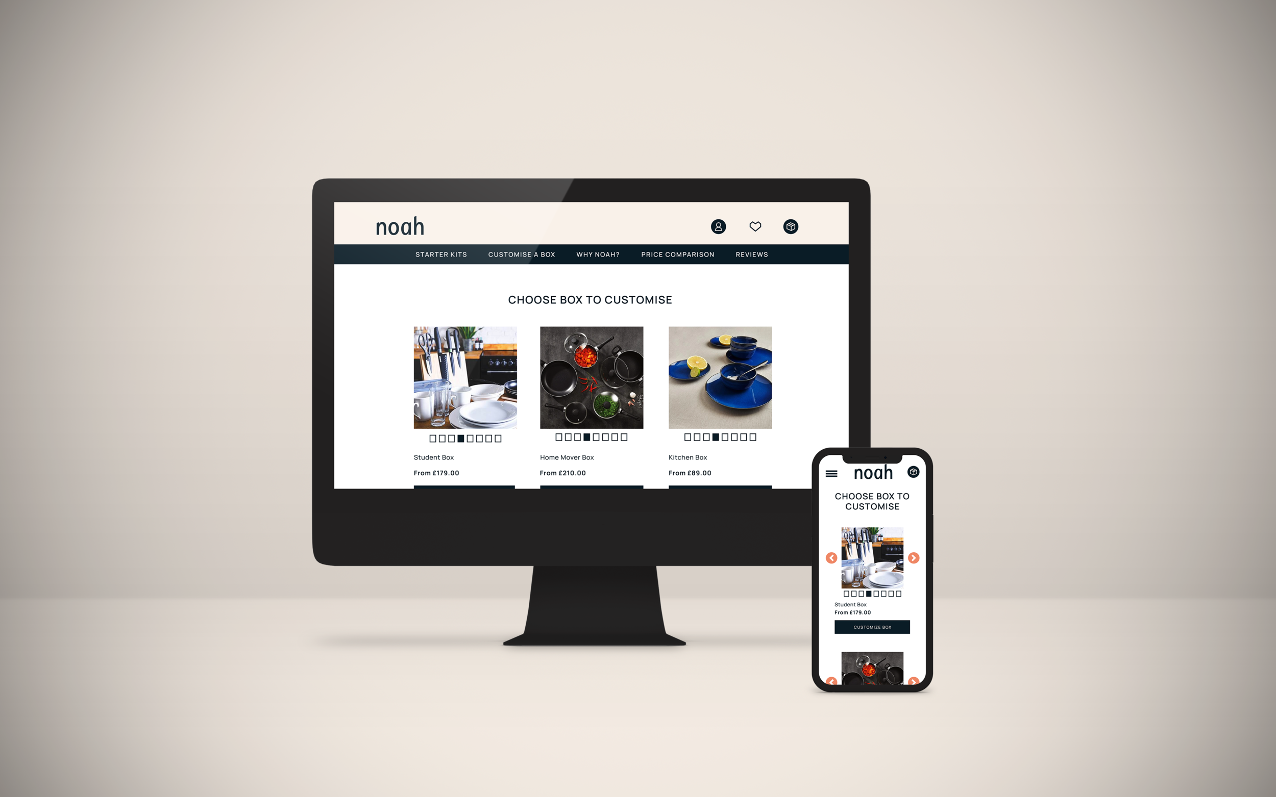
HIGH FIDELITY WIREFRAMES
PROTOTYPE VIDEO
Prototype video
What I learnt
During this project I learnt about Stakeholder management and how to justify design decisions by always backing it up from the findings of user research to validate changes.
What would I do differently?
If I had more time to work on Noah’s Box I would further improve UI elements, making sure various icons are legible and the correct size that users can press with ease.
Was there anything that went wrong?
When conducting user interviews I asked users to go through the current Noah’s box Customise a Box feature in order to detect areas for improvement. However, users had difficulty finding the Customise a Box feature from the home page without any prompting.
Thank you for viewing


