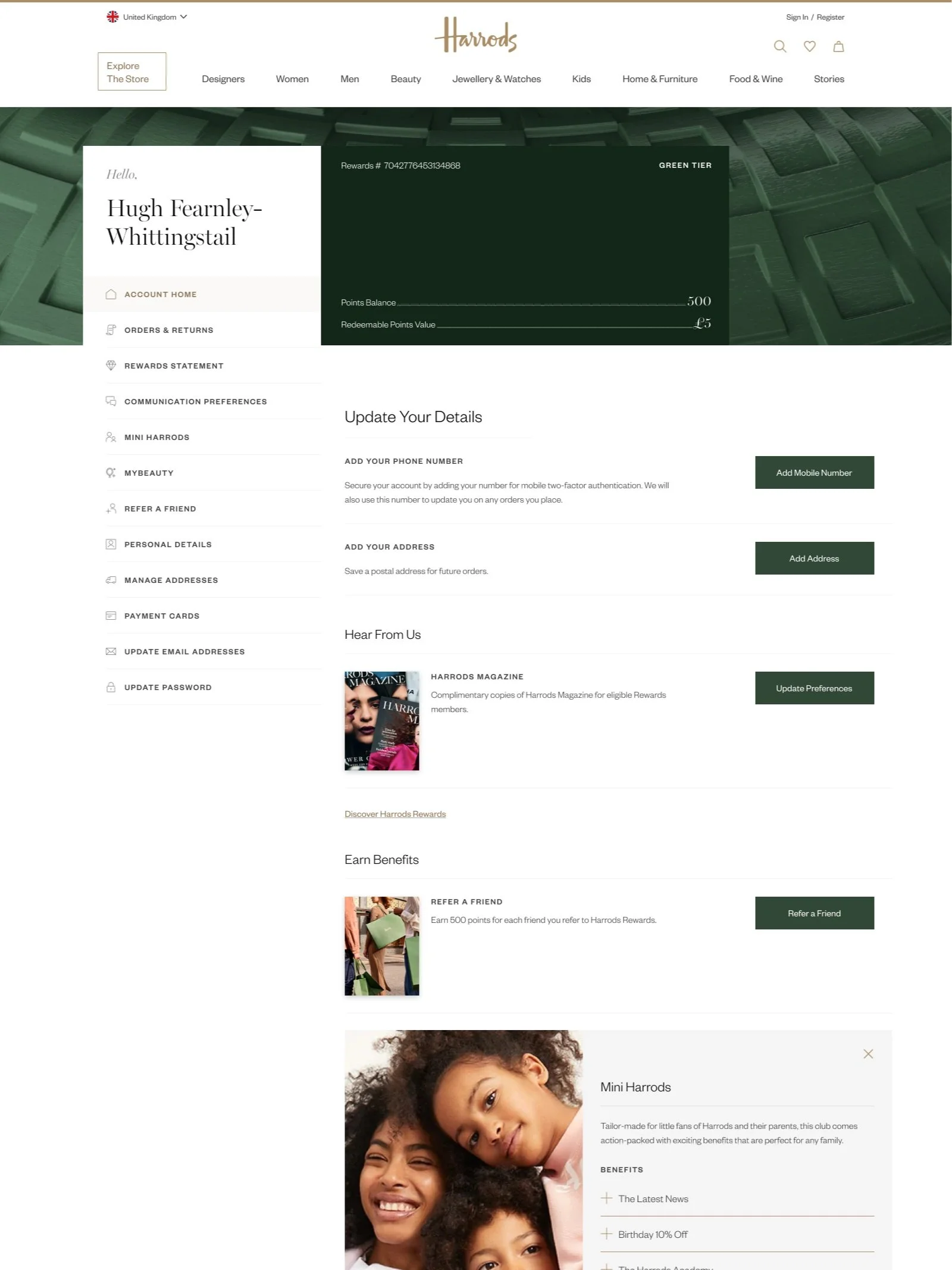
My Account | Harrods
Updating and improving the design of Harrods My Account pages to align with the new app designs.
Responsibilities: UI Design, Icon Design, Wireframing low – high fidelity, dev annotations
Tools: Figma, Adobe Illustrator
PROJECT PHASES
Research
PROBLEM STATEMENT
The Harrods My Account pages are outdated and could be more interactive. The design needs to be updated to align with the app and create a more modern aesthetic accross the pages.
Hypothesis
By redesigning the Harrods Account pages will allow customers to be able to easily navigate to the information they are looking for with an updated, modern UI.


Ideation
Outcome
HIGH FIDELITY WIREFRAMES


Rewards card tiers
Improved Navigation
Created Navigation Cards instead of list. This is more interactive and easier t

What I learnt
During this project I learnt about Stakeholder management and how to justify design decisions by always backing it up from the findings of user research to validate changes.
What would I do differently?
If I had more time to work on Noah’s Box I would further improve UI elements, making sure various icons are legible and the correct size that users can press with ease.
Was there anything that went wrong?
When conducting user interviews I asked users to go through the current Noah’s box Customise a Box feature in order to detect areas for improvement. However, users had difficulty finding the Customise a Box feature from the home page without any prompting.
Thank you for viewing